The app is made with 3 pages or tab’s and with the page navigation (swiping) these are accessible.
In the page shown at startup, is the Week page and shows the current date and week and user van select a different date and new week number is calculated.
The current week can be shown in the icon of the app.
The page to the right (accessible by swiping to the left) is the Planning page. This is intended for simple planning calculations. The page to the left (accessible by swiping to the right) is the Setup page.
Week page
The Week page shows on the top right the Current week number.
The current week can be shown in the icon of the app, this is done by a manual icon change.
Start Week Number app and press the yellow Change Icon button, it show a popup with the new icon and click ok OK. Then the icon of the app will show the current week number.
With the datepicker user can select a new dater. Select a date with the datepicker and it automatically shows the week number belonging to that date. There are two datepicker styles available, one with the wheel and one with the graphical calendar type of view. To change between them go to the Setup page.
A Today button is added to go back to current date quickly.
Planning page
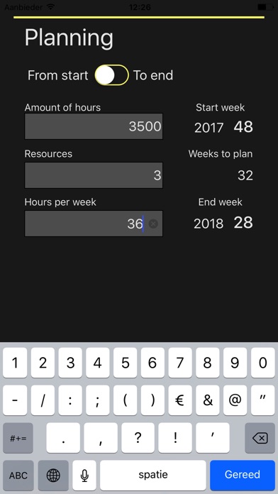
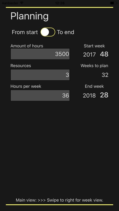
The Planning page is on the right. By swiping to the left the app will show the planning view. Here you can enter the amount of hours the project needs, the amount of persons (resources) that will work on the project and the hours per week these persons can work on the project.
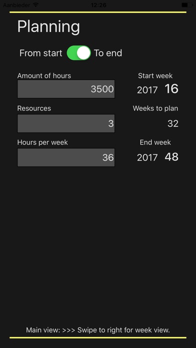
The planning calculation works with the week number you have selected in the Week page. User has two to options:
- Start from the week you have previously selected, then it will calculate the end week, or
- End on the week you have previously selected, then it will calculate the start week.
The values that are entered at Amount of hours, Resources and Hours per week are stored and remain available after stopping the app. The next time the app is started the last values of these parameters are show again.
By swiping to the right one can return to the screen of Week page.
Setup page
In the Setup page there are several settings that can be changed.
For the preferred type of datepicker user can make selection between a wheel or a graphical calendar type of view.
The different colors, like background, text, button and lines can be selected by user. With every color the selection can be done either with a grid containing pre defined colors, a color spectrum or with color sliders.
The colors and the type of Date picker are stored and remain available after stopping app. To store the settings user has to go back to the Week page. The next time the app is started the last values of these parameters are show again.
There is also a Defaults colors button available to restore the colors to the original setting.


